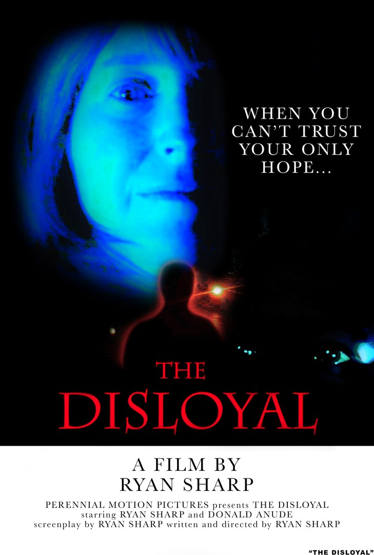
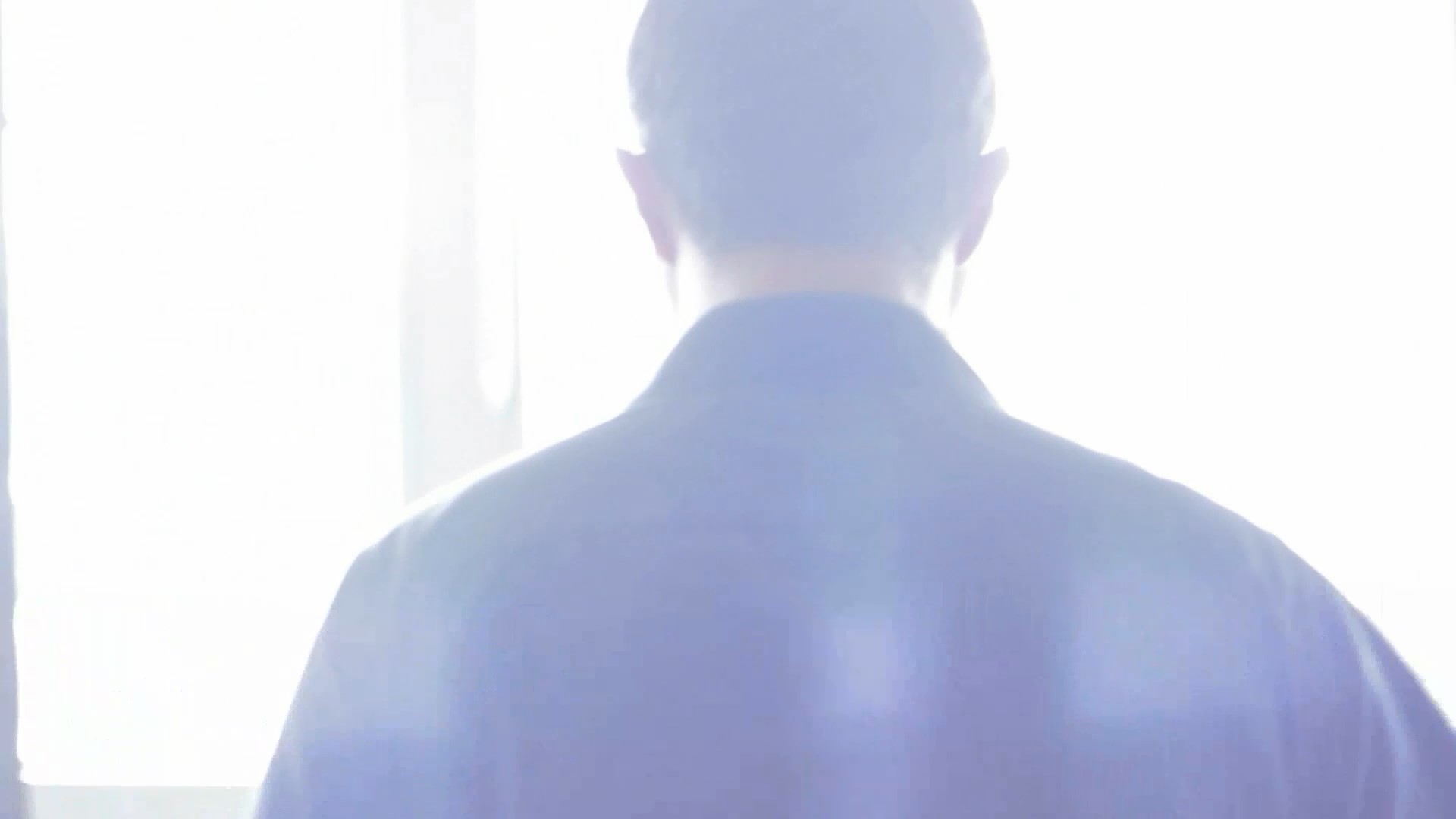
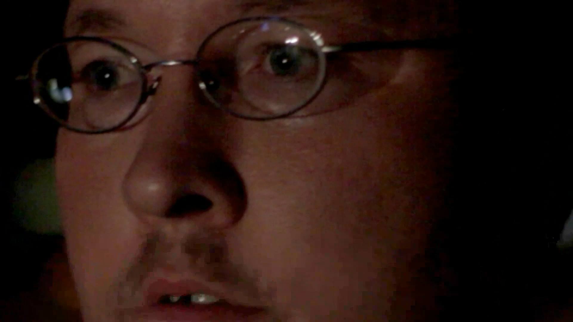
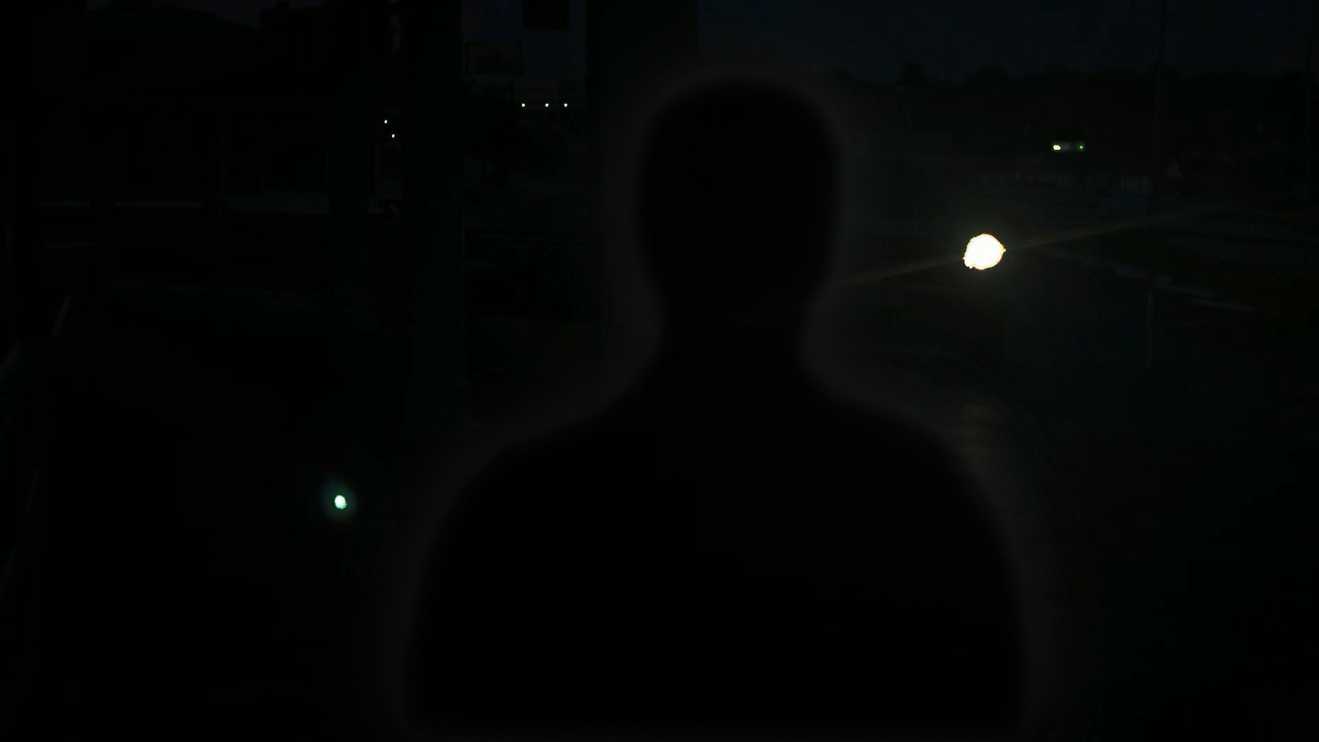
The Disloyal is based on a real nightmare that writer, director, and producer of the film, Ryan Sharp, had one night. The film is a throwback stylistically to the early 1970s psychological horror films, of which Sharp is a big fan. Even the movie poster pays homage to the 1970s. Sharp finds horror more in the hidden emotions that we all deal with instead of in the typical blood and guts killer film. Hold on to your seats for this emotional thrill ride.
Writer, Director, Producer, and Star Actor – Ryan Sharp

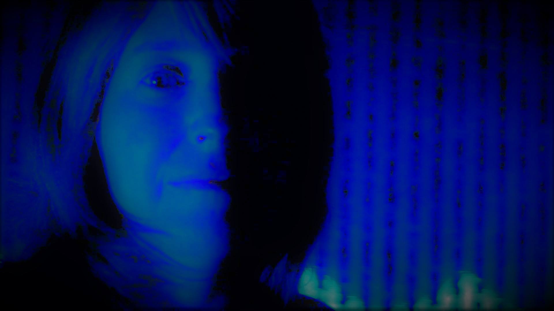
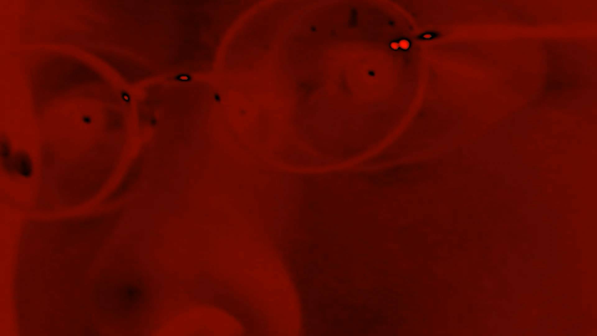
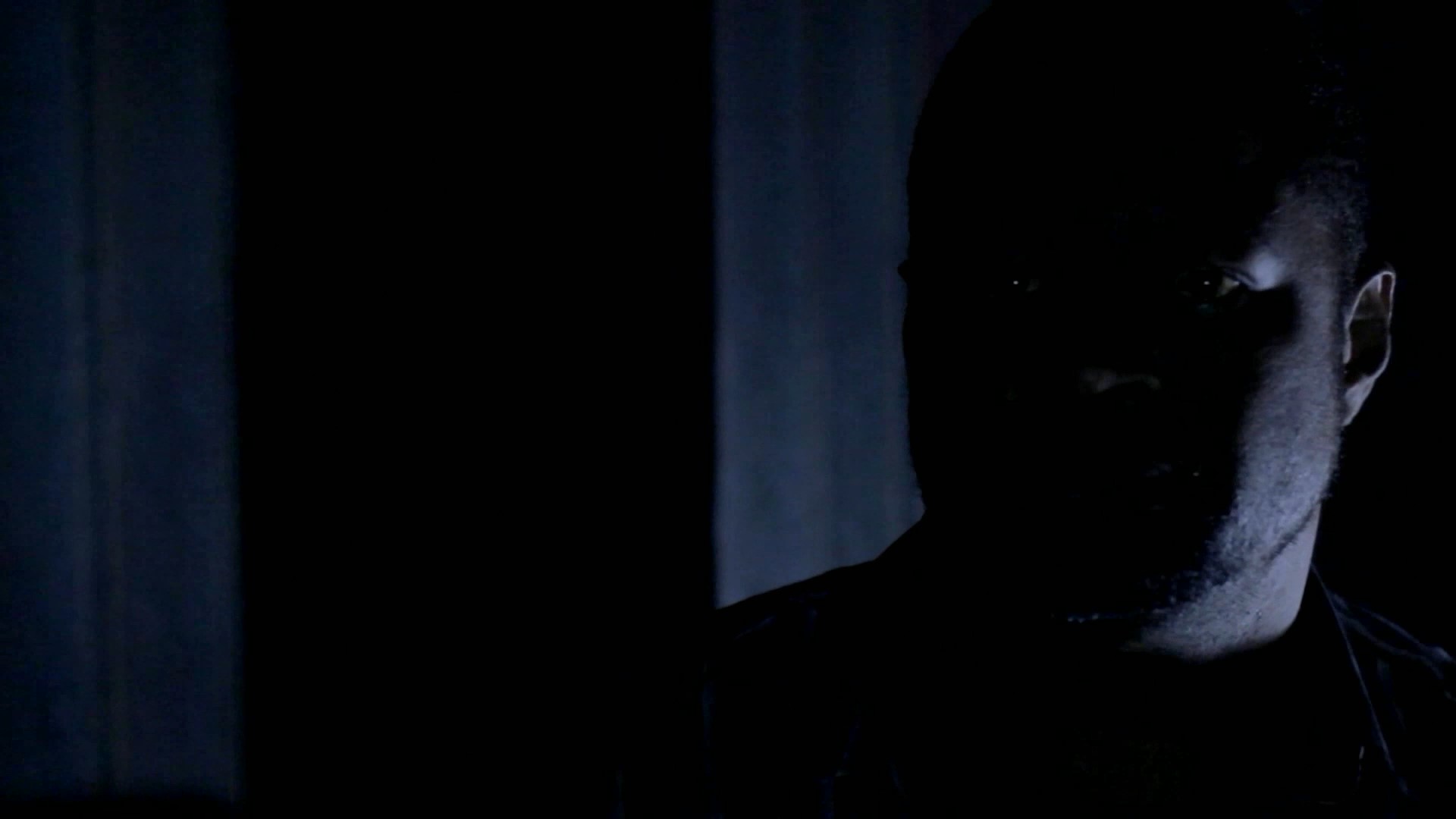
Director Commentary
I had a nightmare one night that really kind of horrified me and showed me the reality of how horrible the emotional terror of rejection is. I have always been someone who has been on the outside looking in and wondered why. I have been rejected by friends, family, and about everyone it seems, and I gain some comfort in knowing that as a Christian, that is part of the cost. Jesus said, “if they rejected me, they will reject you.” Still, it hurts because we are still human. So I thought if I could ever replicate my nightmare on film, it would be tremendous. So the Disloyal is my attempt at replicating that nightmare. People who have watched the film have had many different feelings and interpretations. I love hearing those because the movie does really make you think and it cuts to the core emotionally. For me, the film is about the emotional horror of being caught in an endless cycle of being rejected over and over again. But for someone else, you could replace the emotion of rejection with abuse or career stress or whatever else is constantly hurting you. I also set out to make a movie that is emotionally visual, like a roller coaster, with the most minimal dialogue possible to move the story. So I really wanted the film to speak for itself visually first, which is what all good films do. And I wanted the audio to reach the emotional level as well and to work with the visual to feel like an emotional roller coaster. It is really meant to bring out whatever emotion or problem keeps nagging at each individual. For me it is rejection. Another guy, who saw my film at a festival, told me that he was abused as a child and it helped him work through that. Someone else at a different festival interpreted the end differently than I did. And that’s what I like about it. It means something different to everyone. Stylistically, I decided that the late 60s and early 70s horror style would lend itself well to this script because those films were very visual and didn’t need blood and guts to communicate the horror. I’m a big fan of science fiction movies from that period, like Solaris, 2001, Soylent Green, Logan’s Run, the original Rollerball, and many more. I also like how Martin Scorsese directed the Cape Fear remake with color filters and negative art while also using the original score. I really can’t stand remakes typically, but that one is extremely good. I also liked the Solaris remake. Its not as slow as the original but it does pay homage to that style and is very well done. With that said, those theological slow scenes in the original are what really made that film great. All of those films, really kept you on the edge until the last frame of the movie, which was often frozen or in slow motion. And that image would just scare you to death or it would just make you think. I also wanted to use a lot of color filters and play with the film speed, so my editor really helped bring that part of my vision to reality. A little hint that points to what the film is about – the main character is not the biggest image on the movie poster, he’s really not even seen and is just an afterthought, which again points to the rejection the character feels. I thought the story really called for that and besides I wanted to be the first filmmaker to have a movie poster that didn’t reveal the main character or make him big, front, and center. My wife actually gets the spotlight on the poster, but her screen time is about 5 seconds and she’s not a main character, partly because she didn’t want a speaking role. But does she ever nail it in that 5 seconds. My best friend Don is the supporting actor in the film. He’s not really a villain. In fact, he plays a pastor. But he represents the everyday person who tells you he’ll help you or call you and yet never does. Ironically, Don is not that kind of person. He’s one of the rare types that actually does what he says he’ll do and follows through. Thus, that gets me to the title of the film. It seems from the title like another affair story, but its not at all. The Disloyal refers to people who are disloyal to their word. Really, the opposite of Don, who is a loyal friend. The Disloyal are the people who pat you on the back one on one but then ignore you in public. They are the people who pastor a church but could care less when you are hurting. (Luckily not all pastors are like that). They are the people who say they will call, but never do. So that’s what is behind the title. The color and style of the font was actually inspired by a very famous film that everyone knows. See if you can guess. I love talking about film in general and could probably go on and on, but needless-to-say, I’m always willing to show my film and anxious to hear how others interpret the roller coaster.